PACKAGINGDe Kuyper
Labels
De Kuyper Labels
Led the production of De Kuyper’s label redesign, encompassing 42+ flavor variants, each featuring unique flavor artwork and color palettes. The project demanded meticulous attention to detail, ensuring each label was distinctive, while ensuring cohesive standards across all variants. Attended press checks to ensure quality.
Front and back pressure-sensitive labels, metallic and extended gamut printing


Jim Beam
RTDs
Jim Beam RTDs
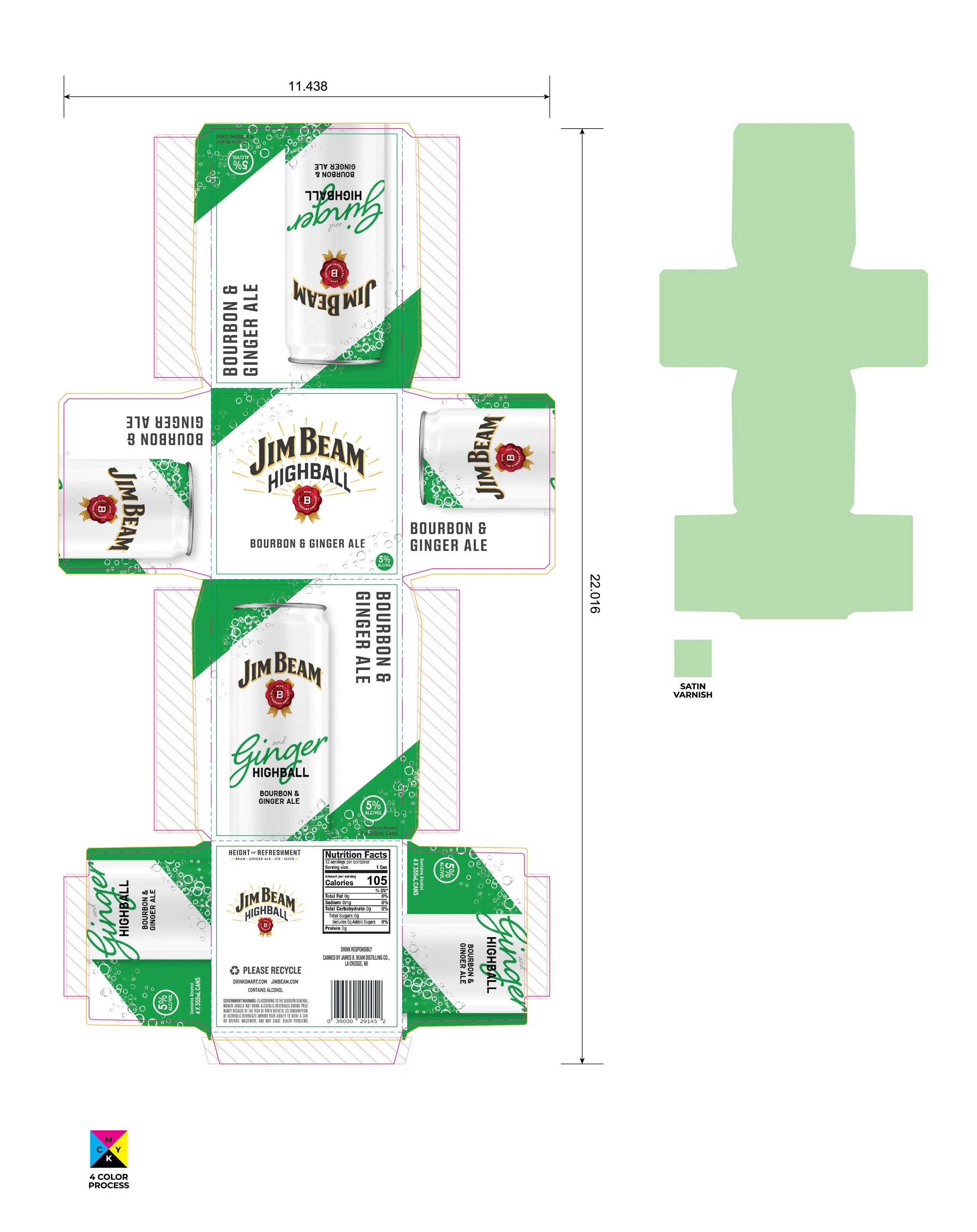
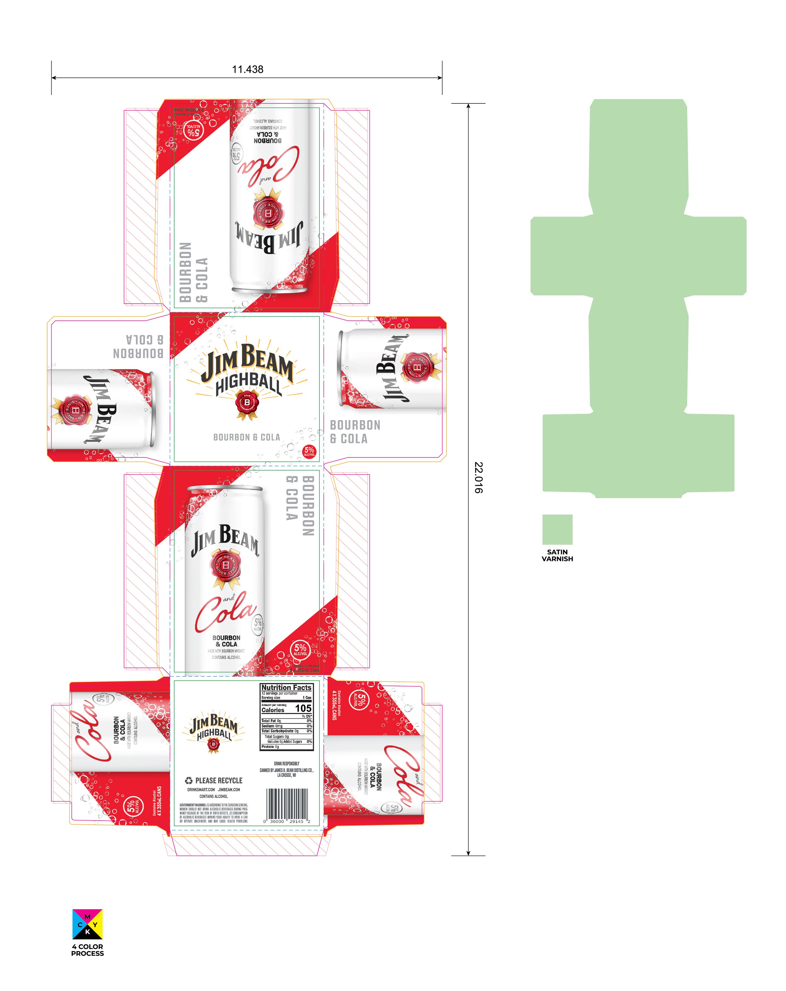
Oversaw the production of the newly designed Jim Beam RTD—delivering art for four different flavor cans housed inside four separate cartons.
Production details: To maximize opacity, two hits of white ink, while each color is printed directly over the can allows the metallic substrate to shine through for a vibrant impact. Knockout techniques strategically reveal text, maintaining precision with a five-thousandth of an inch hold back between colors. An overall satin varnish adds a tactile finish.


Jim Beam
VAPs
Jim Beam VAPs
Led the production for Jim Beam VAPs several years coming. Whether it’s evergreen VAPs or for the holidays, Jim Beam needs to maintain its brand standards, while taking on a variety of different packaging shapes. For the variety of VAPs, each pack needed to be premium, while on a tight budget—so do more, with less. Several materials were emulated using unique varnishes and finishes as a cost-effective and creative solution.
Front and back pressure-sensitive labels, metallic and extended gamut printing
Jim Beam Black Checkers Pack
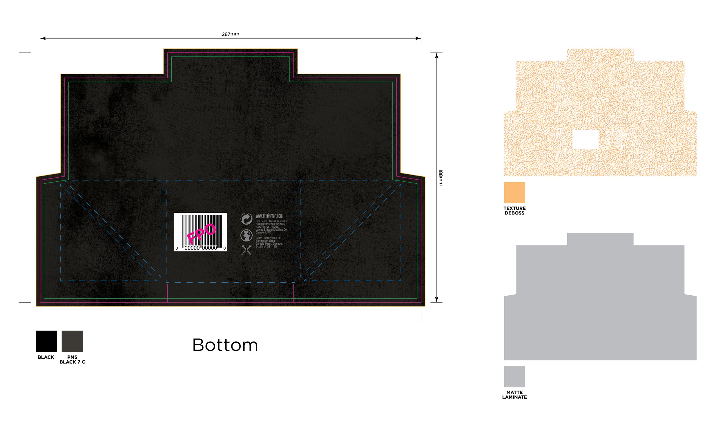
Emboss and deboss used to emulate leather texture, with gold metallic finishes


Jim Beam Tin
Multi-level embossing to add texture to in the rosette and details of the tin pack
Jim Beam Double Oak Gift Boxes
Emboss and deboss used to emulate wood grain texture on the back, and blue suede texture on top, with gold metallic finishes


Jim Beam Cheers Pack
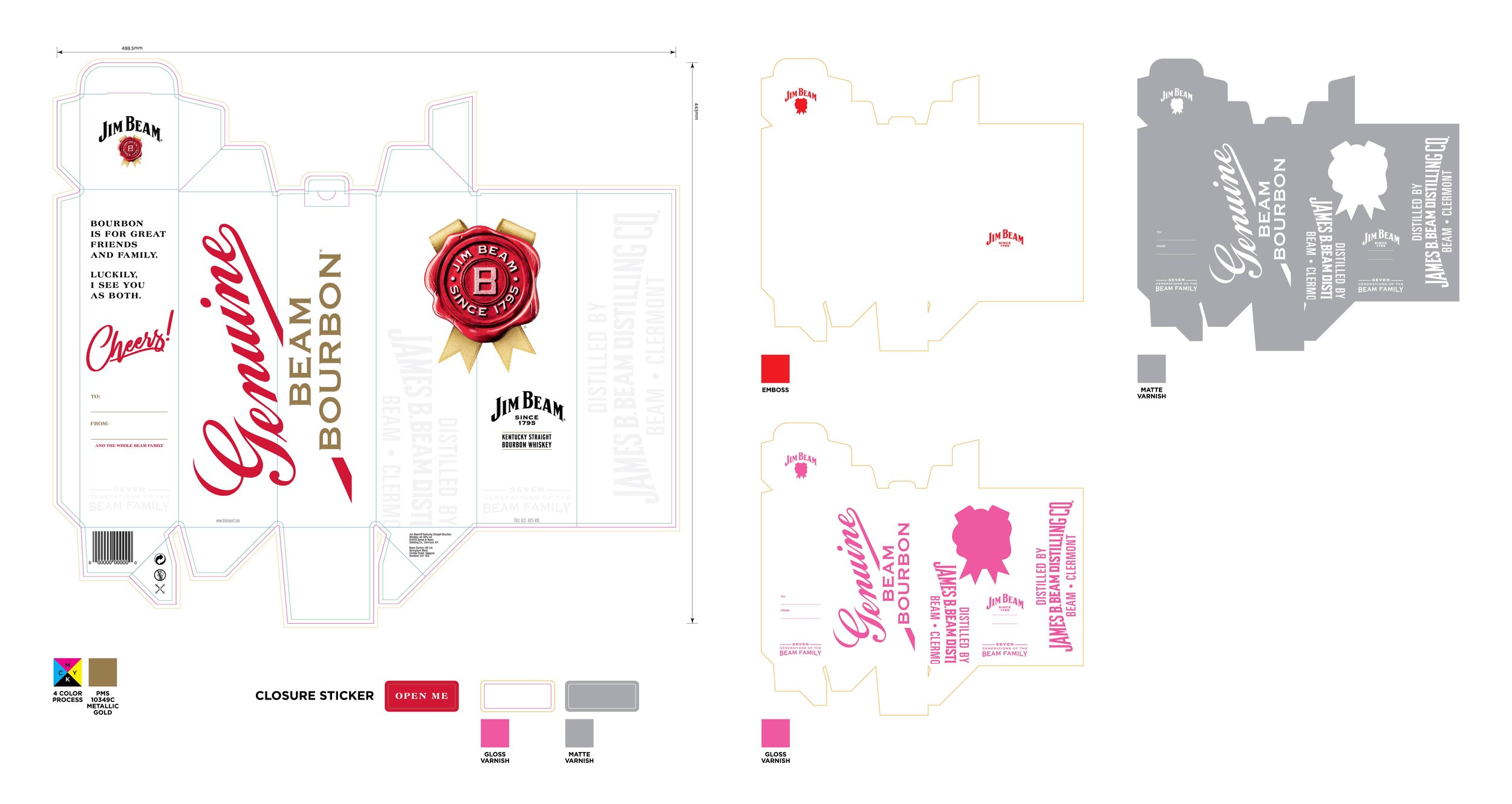
Carton with sticker ribbon to open and reveal a writable gift message


